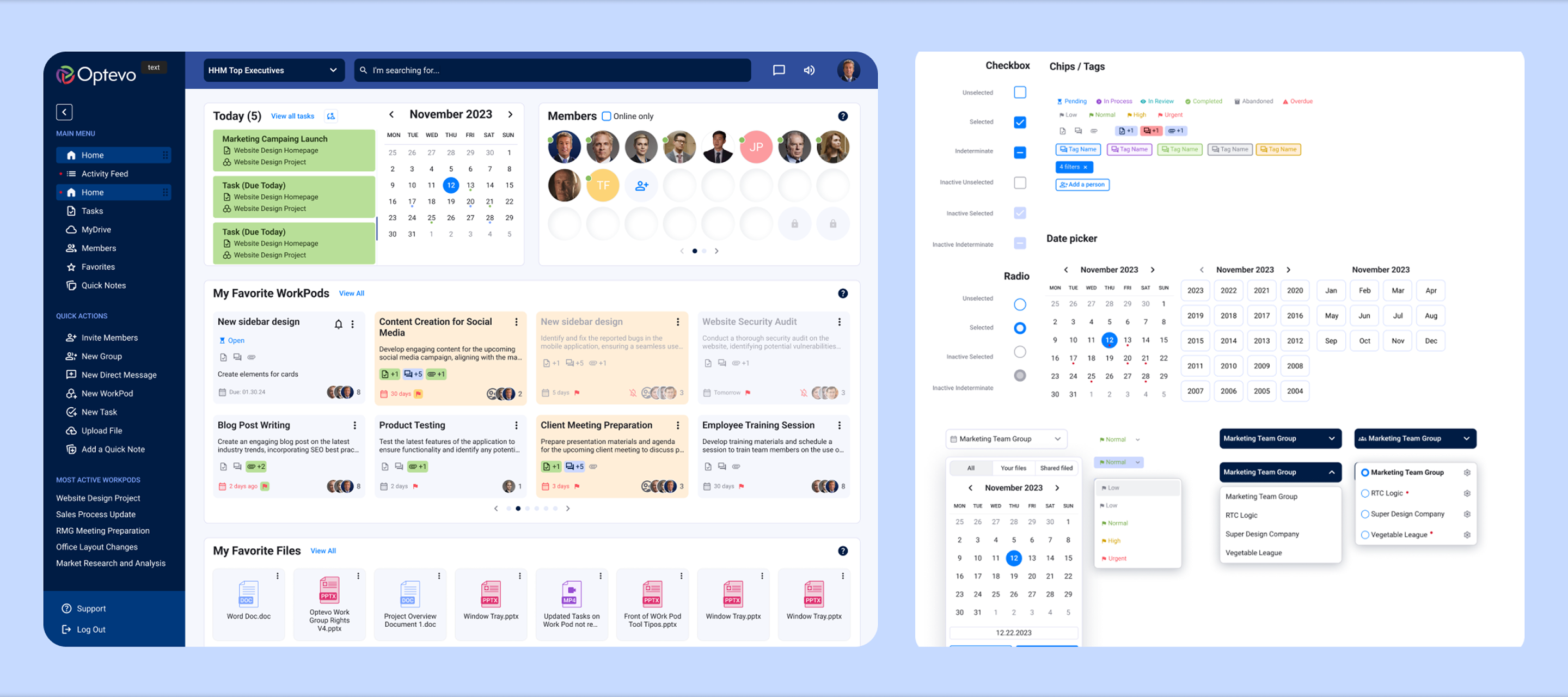
Menu Hierarchy
Redesigned navigation structure with clear hierarchy to reduce cognitive load and improve discoverability of key features.
Case Study
Overview
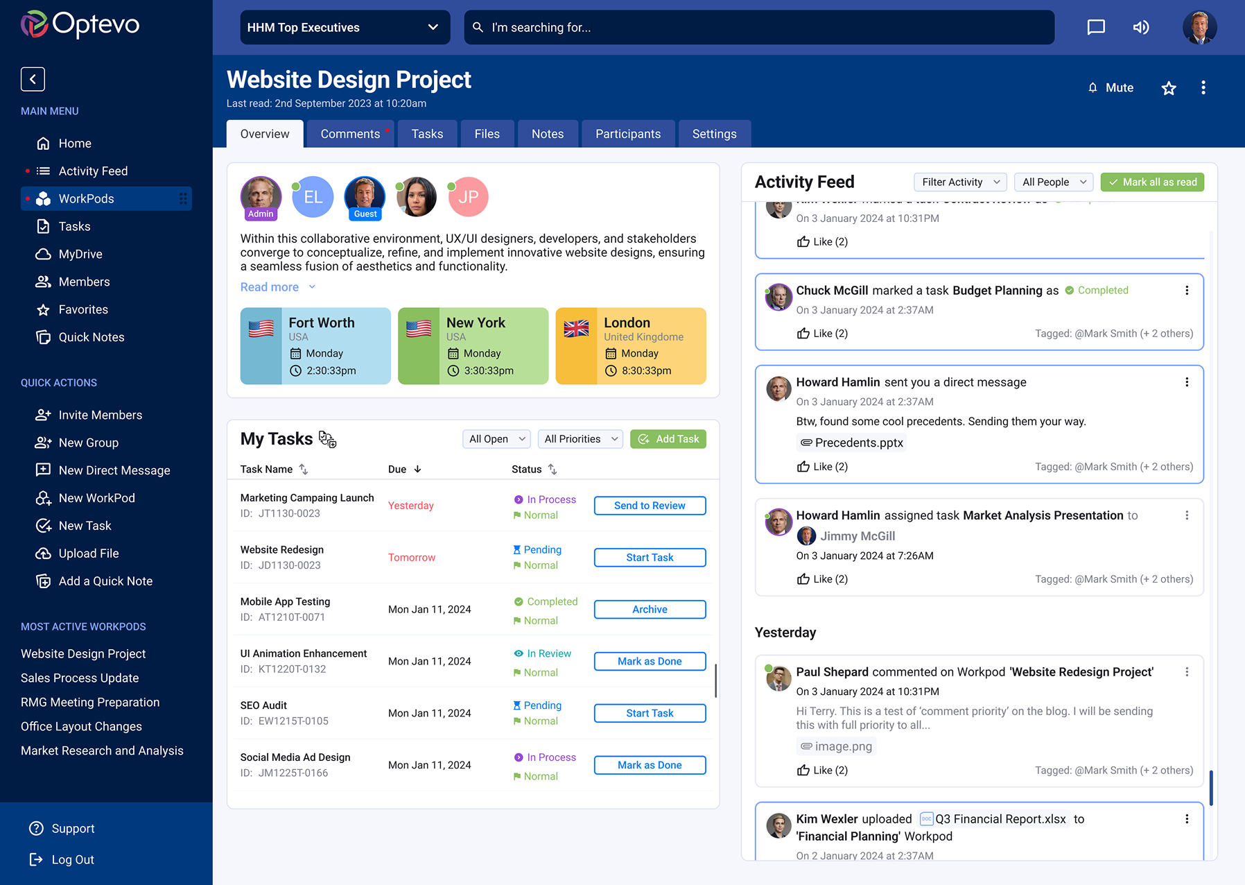
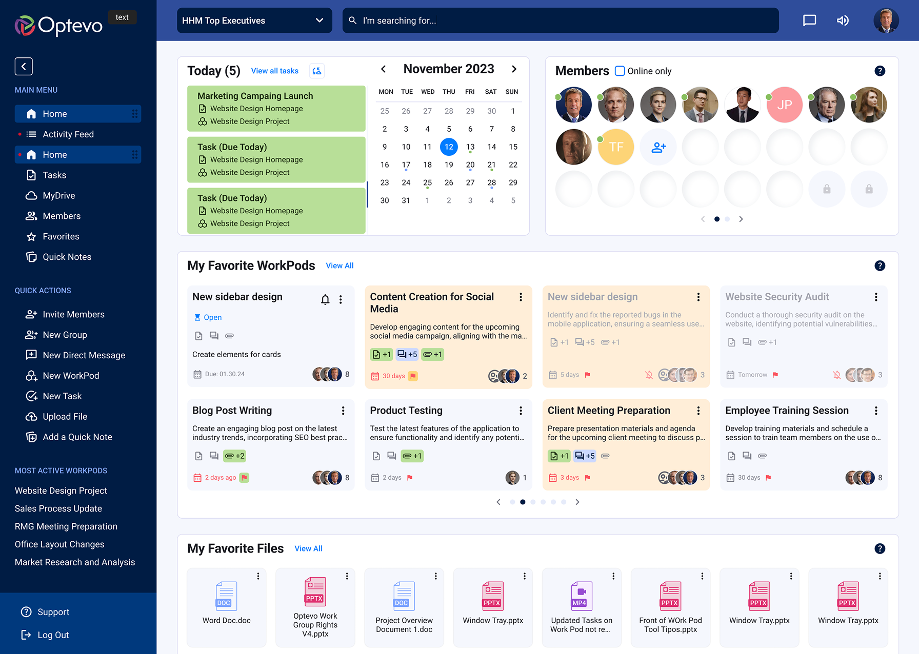
Optevo introduce a new entity called Workpods — a collaborative space where users can work on projects, organize tasks, track progress, share files, and communicate with team members, all in one place.
The client had a legacy design for their website and a rough vision of what the new design could look like. The legacy design was cluttered, disorganized, and outdated. According to user surveys, the old website was illogical and did not display the required metrics.
The site backend was built in a way that every user action was responded to with a new page loading. One of the crucial tasks of both design and development was to radically reduce the number of page loadings. The key goal was to make the WorkPod the central hub for teamwork and provide users with an efficient, real-time collaboration environment.
Create a versatile Design System
Conduct usability research of the legacy website
Adapt the design for mobile devices
Conduct surveys and find out users' pains and desires
Keep some technical pages with the same functionality, but refresh them with a new look
A key aspect of this project was the existing user base, accustomed to a cluttered and complex UI.
The challenge was to approach the redesign in a way that not only tested new features but also guided users on how to interact with them effectively.
Redesigned navigation structure with clear hierarchy to reduce cognitive load and improve discoverability of key features.
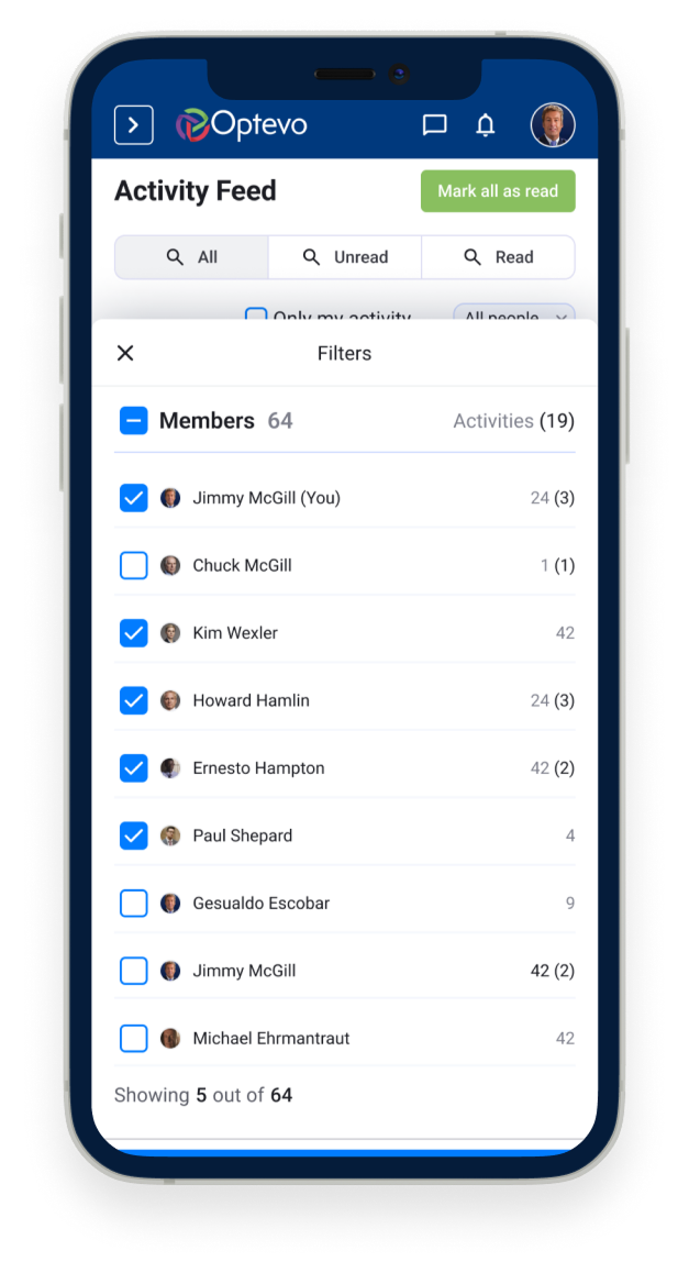
Contextual notification system that surfaces relevant updates without overwhelming users with unnecessary alerts.
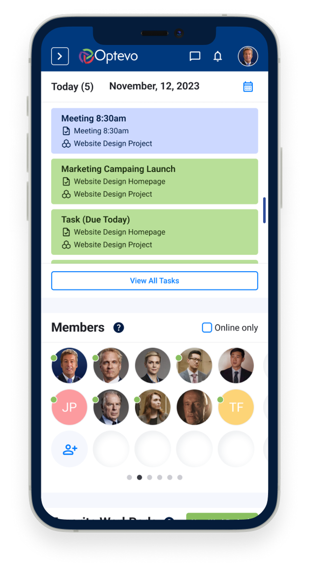
Role-based dashboard views that surface the most relevant information for each team member at a glance.
Streamlined user flows that significantly cut the number of clicks needed to complete everyday tasks.
After conducting customer interviews, we synthesized our findings to create a customer journey and persona, which we presented and discussed with the client. These exercises provided a solid foundation for moving into feature ideation and prioritization.
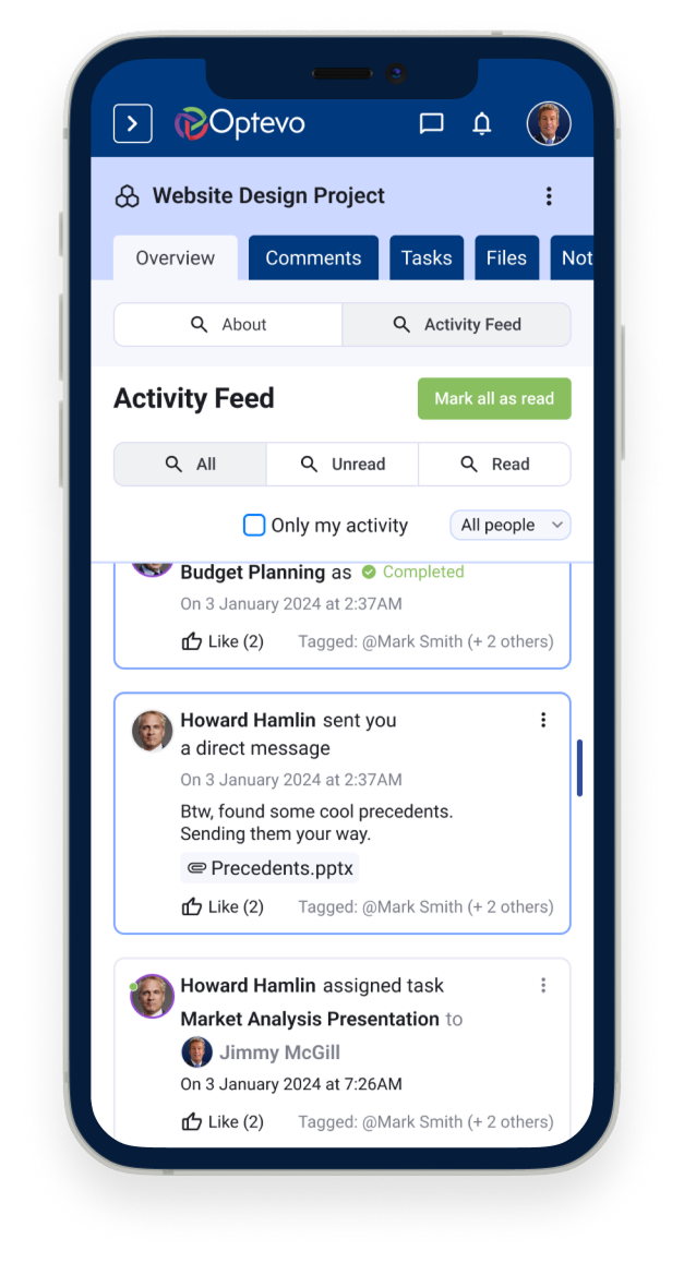
WorkPods are at the core of task management in Optevo. In the updated version, we prioritized displaying key information — such as participant details, updates, and current status — directly on the main dashboard for quick access.
Only team administrators have the ability to create new WorkPods and manage participant assignments.
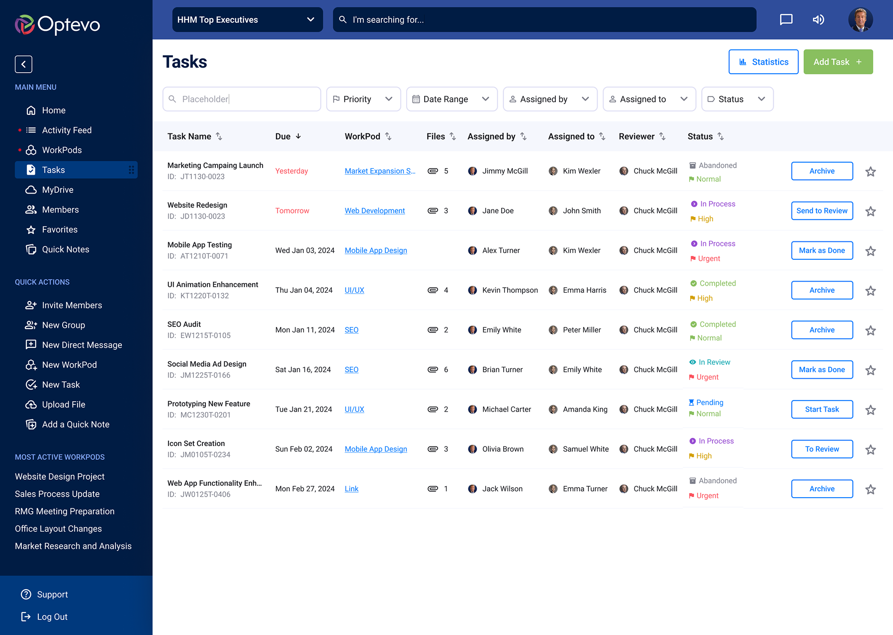
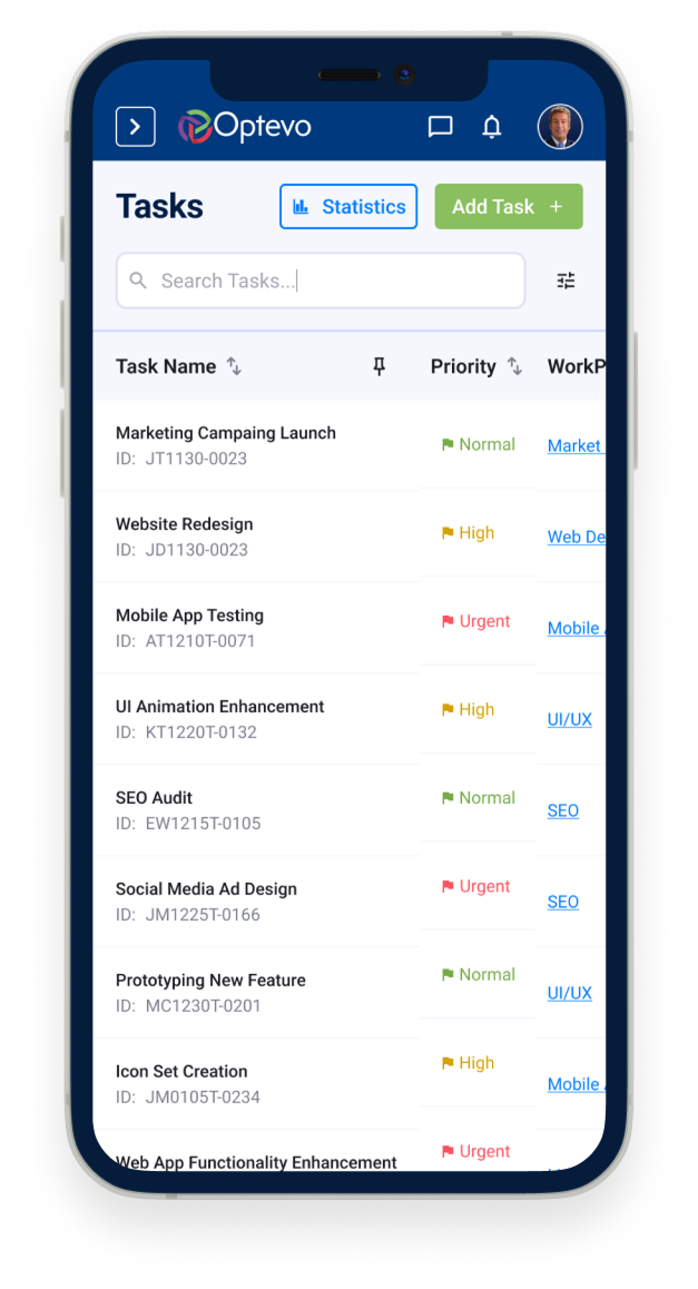
The Task entity is the core unit of work in Optevo. Each task includes a title, description, assignee, due date, priority level, and status. Tasks can be created inside any WorkPod and are visible across multiple views.
Open and complete states are clearly distinguished through color-coded indicators and status labels, allowing team members to quickly assess progress without drilling into individual items.
Adapting large and complex structures for mobile use, especially when dealing with a legacy design full of nested dropdown menus, was a significant challenge.
While we couldn't adopt a Mobile First approach for the Web App — since the vast majority of Optevo users work from desktop — it was crucial to ensure that every page was optimized to display properly on mobile devices.
For iOS and Android, we developed a companion app using Flutter, which syncs all notifications from the desktop version, providing a seamless mobile experience.
Thank you
for viewing!
Want to discuss a project or collaboration? I would love to hear from you!
Get in touch